A picture you explore, not a report you wait for
The dashboard shows. It does not claim.
Every result from a States of Vitality assessment arrives in an interactive dashboard - not a PDF, not a slide deck, not a report you wait three weeks for. A live picture you explore, filter and share.
It is designed to surface the shape of your organisation’s health honestly. Where conditions are strong, it shows that. Where they are thin, it shows that too. Where two groups experience the same organisation differently, it shows the gap rather than averaging it away. It does not tell you what to think about what you see - that is your conversation to have, and ours to support if you want us to.
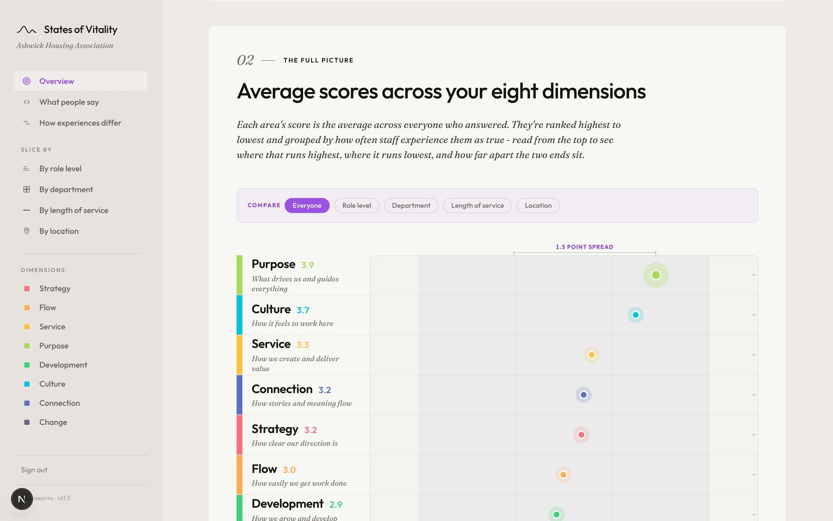
The shape
The overview shows every dimension scored and ranked, so you see the spread at a glance - which conditions sit highest, which sit lowest, and how far apart they are. The shape of the scores across the eight dimensions is often the first thing that tells you something.
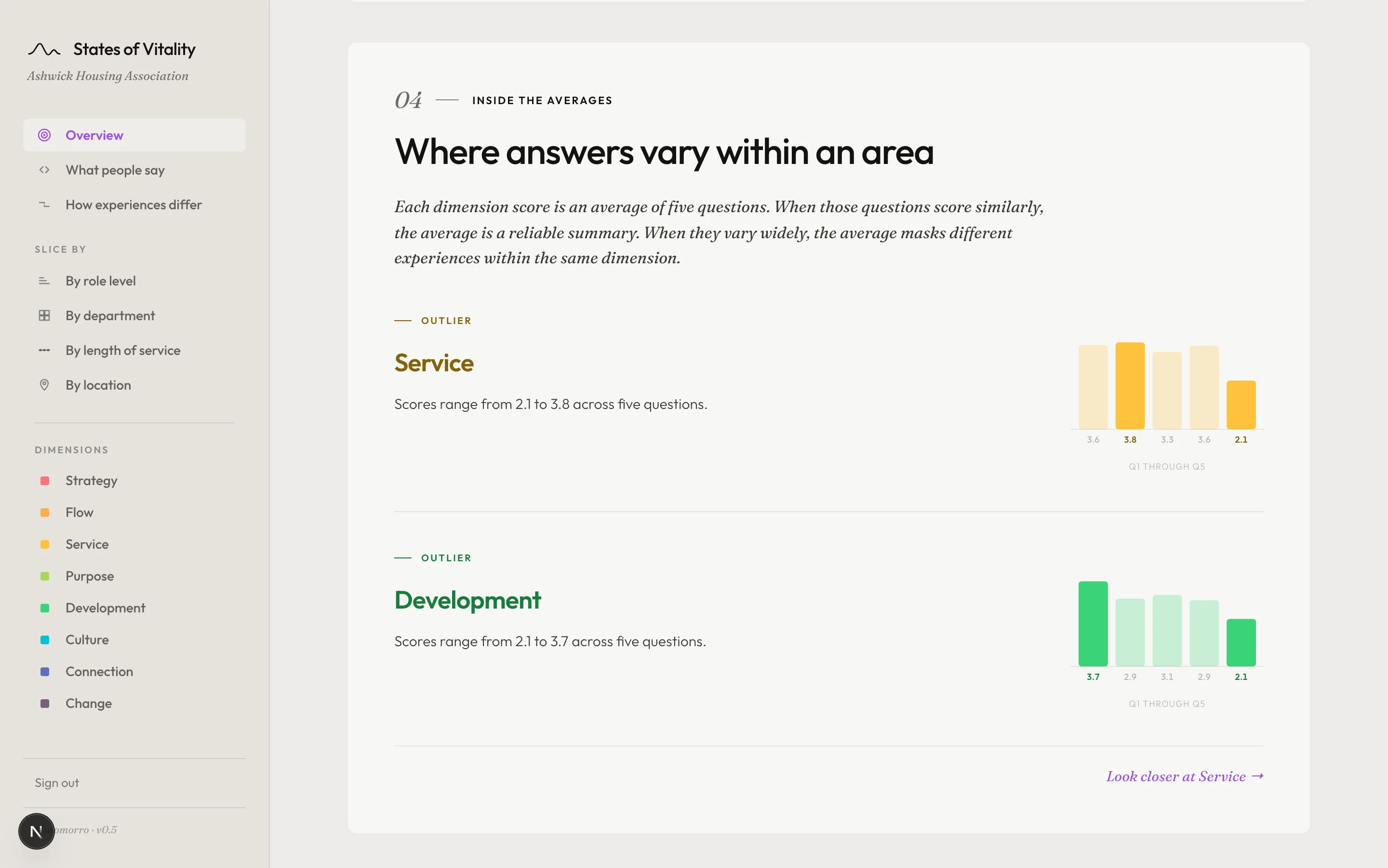
Beneath the average
Open any dimension and its five readings separate. A Strategy score of 3.4 might rest on five similar readings - or on two highs and three lows. The mean is the same. What it describes is not. This is where you find out which it is.
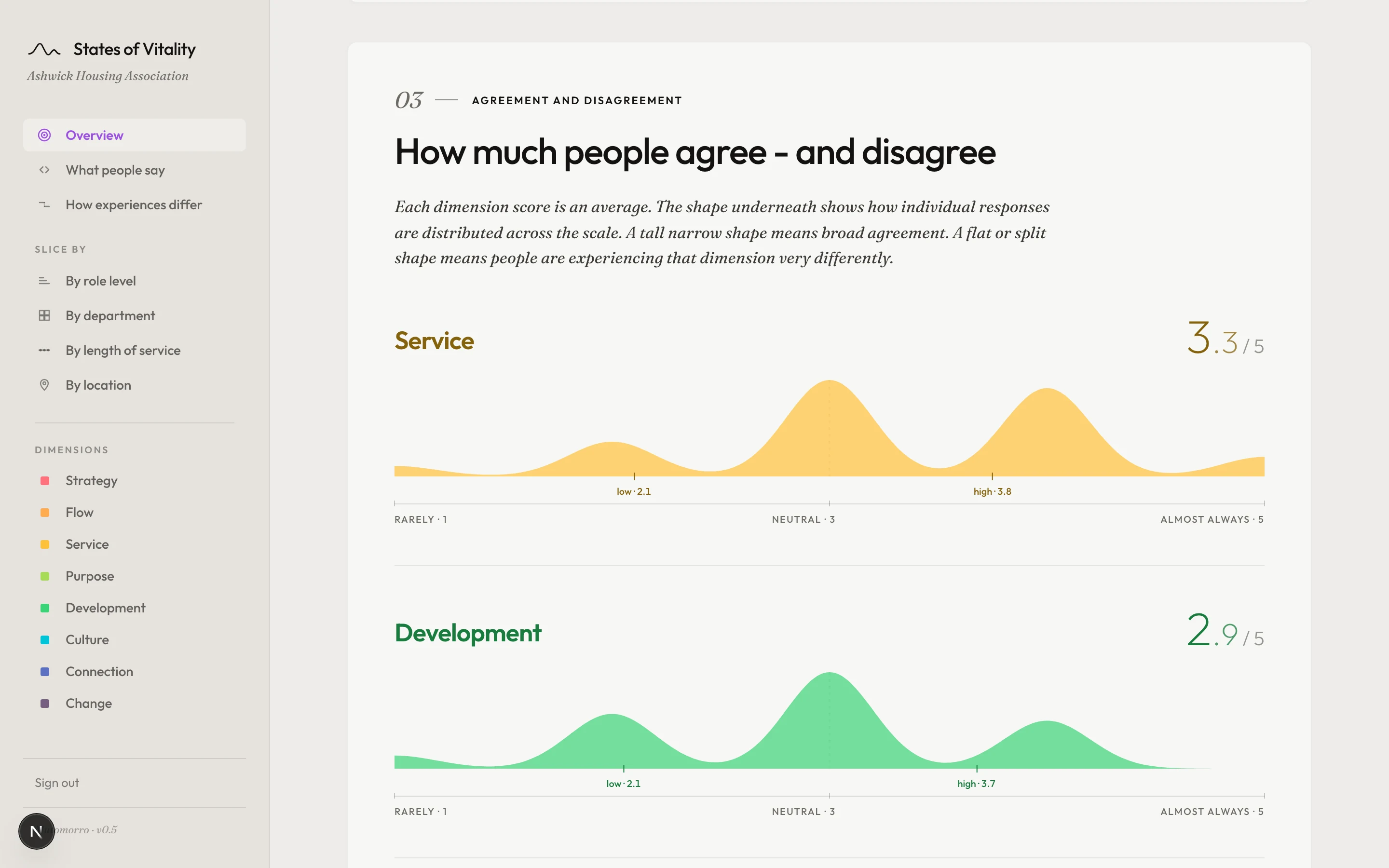
Agreement and difference
Some scores carry broad agreement - most people see it the same way. Others carry a wide spread, where the same question draws very different answers depending on who is responding. The variance view shows where the organisation agrees with itself and where it does not.
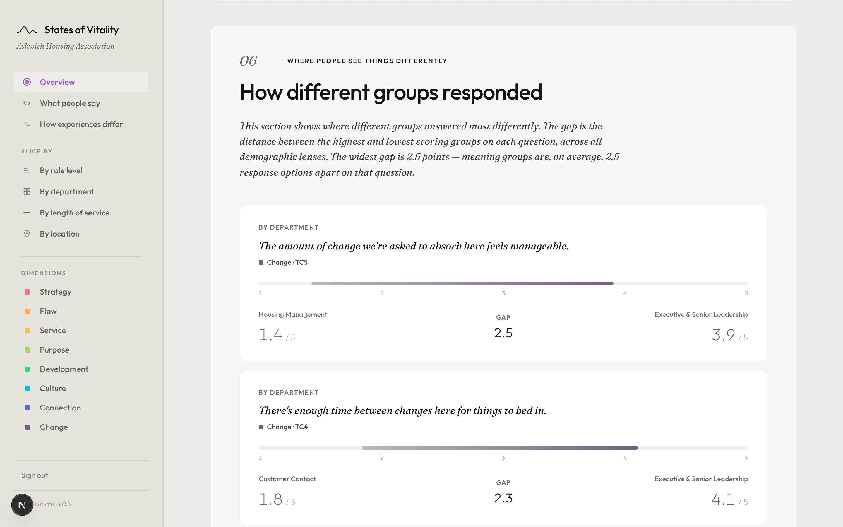
By group
The same score, read by seniority, department, tenure or location. This is where perception gaps surface - where two groups are working in the same organisation and experiencing it differently. Every comparison is shareable as a link, so a conversation about a specific gap can start from the same picture.
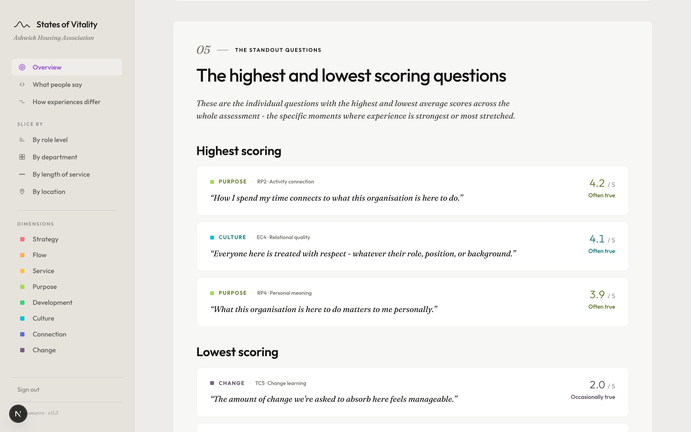
Standout questions
Across all forty statements, the dashboard pulls out the ones scoring highest and lowest. These are often more immediately useful than the dimension scores themselves - a single statement that the whole organisation answers the same way is a finding, whether it sits high or low.
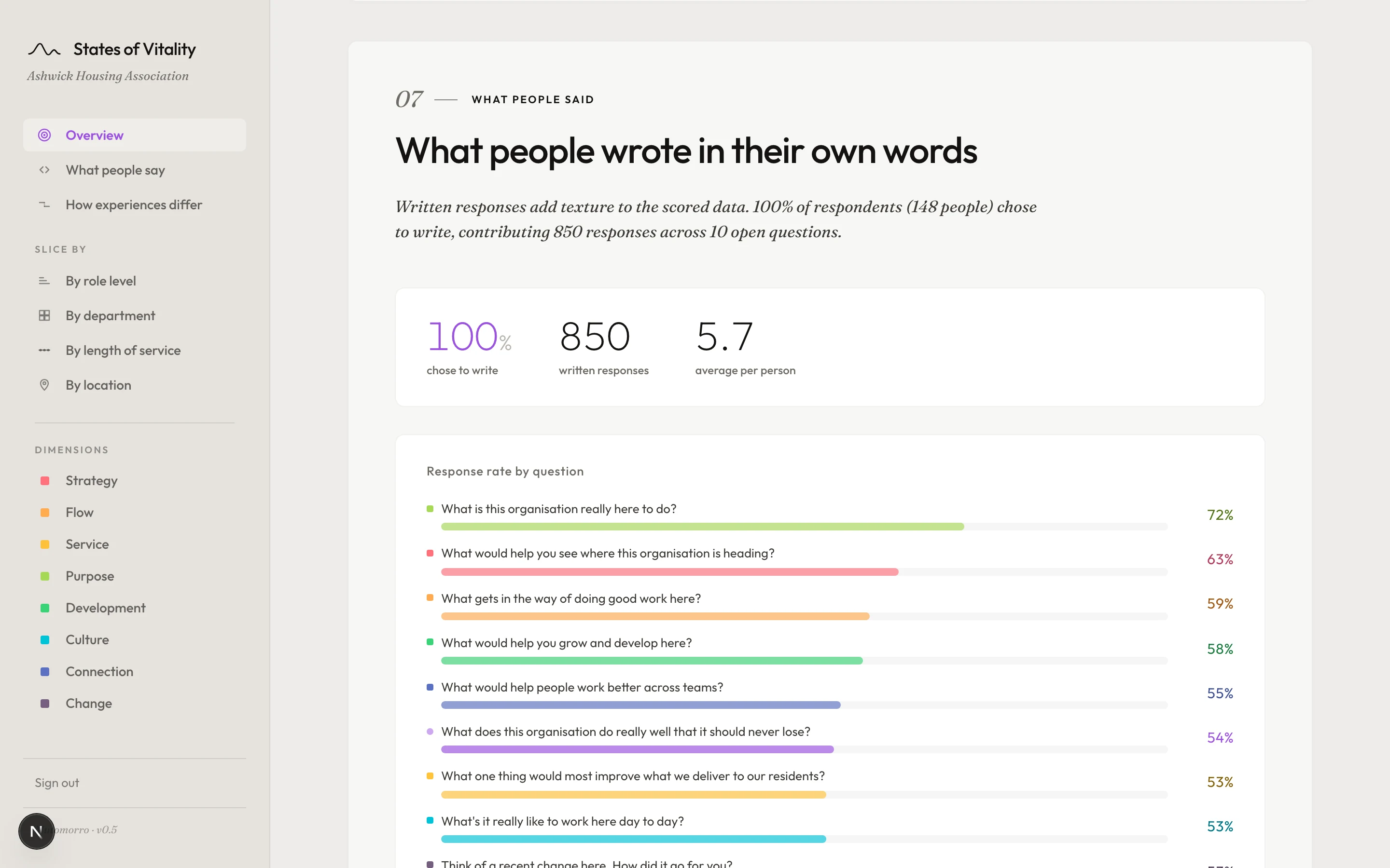
In their own words
Alongside the scores, people write. The dashboard shows their responses as written - not summarised, not categorised, not reduced to a word cloud. The numbers tell you what is happening. The words tell you what it feels like. Both sit in the same place.
This is what you would see
We can show you what it looks like with your own organisation’s data - scope, timing and price.